


- Sat Oct 13, 2018 3:14 pm
#3017
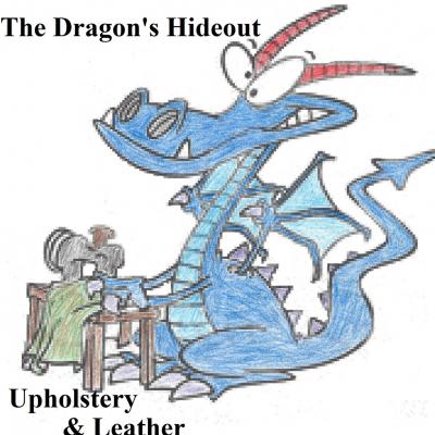
Hey guys I'm considering a possible logo change. What are your thoughts on these designs?
Option 1
Option 2
Option 1
Option 2

 - By Dmitry_CAD
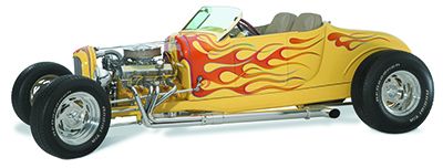 - By Ron Henningsen